If your LinkedIn feed looks anything like ours, the last few weeks have been a steady stream of screenshots: custom dashboards, live data feeds, automated workflows, all built with Claude. All built using MCPs.
And almost every explanation assumes you already know what an MCP is.
This article is for everyone who doesn't. It's the follow-up to Part 1 of our Claude for Marketers series, where we covered getting started with Claude: writing in your own voice, monitoring competitors automatically and generating ad variations with a Figma integration. MCPs came up there briefly. Here's the full picture.
We ran a second webinar on this with Pietro (who trains non-technical teams on AI), Luuk from the Contrast product team and Louise from Tella. You can rewatch the webinar here, or simply follow along with the guide.
MCP and Connector: What Are The Differences?
MCP stands for Model Context Protocol. It's an open standard created by Anthropic that defines how Claude accesses information from tools outside its own ecosystem.
If you use HubSpot, Slack, Gmail or any other tool in your stack and want Claude to read data from those tools — or take action inside them — Claude needs a way to connect to them. MCP is the connection standard that makes that possible.
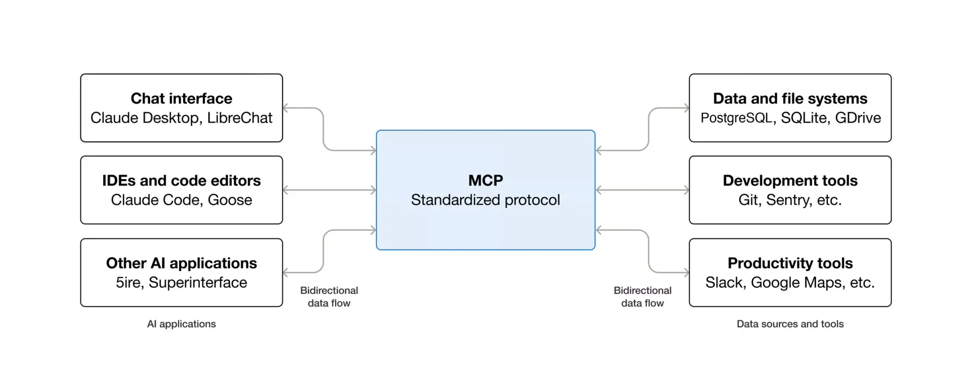
The confusion in most explanations comes from mixing up two related but different things: MCPs and connectors.
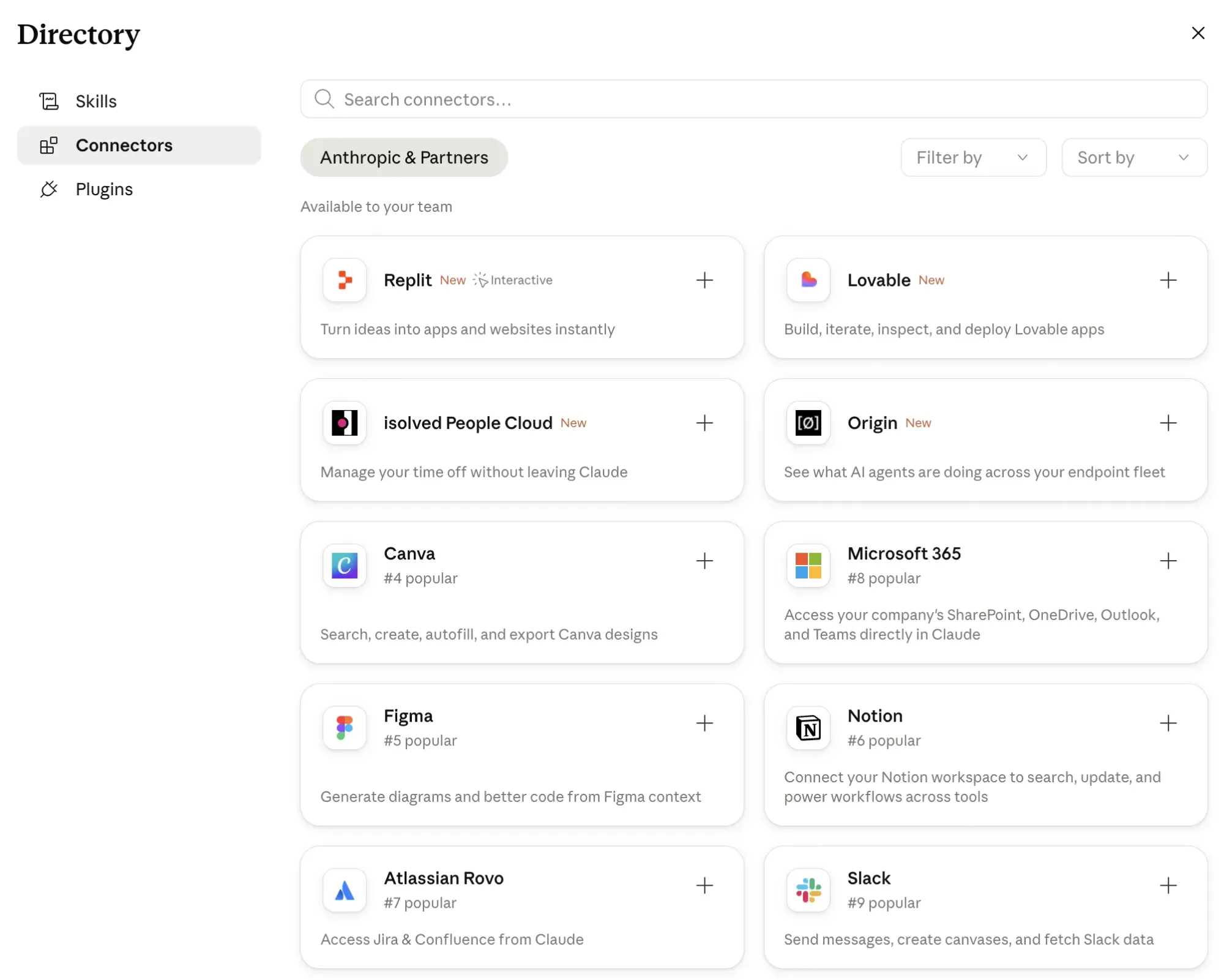
A connector is an MCP that Anthropic has reviewed, approved and packaged for one-click installation. Think of connectors as the official, vetted option — Anthropic has assessed the integration, confirmed it meets their standards, and made it available directly inside the Claude interface. Slack, HubSpot, Gmail and Google Drive all have connectors available today. You can browse the full library here.
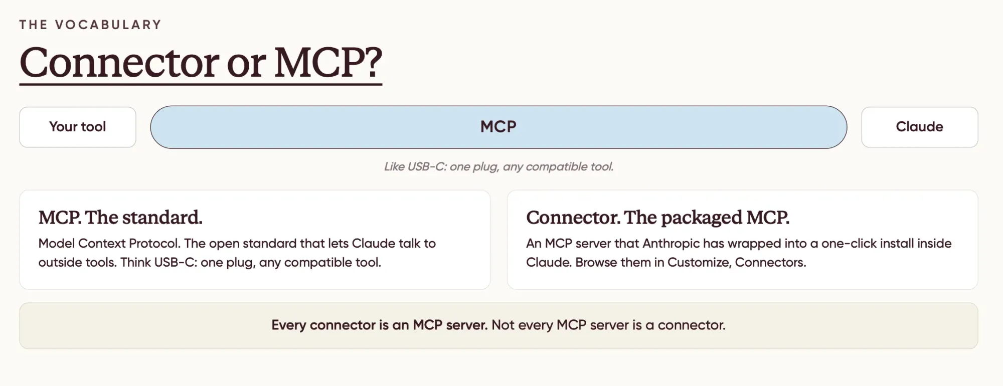
An MCP (outside the connector library) is anything Anthropic hasn't yet officially vetted, a smaller tool, a newer integration or something you install yourself by pointing Claude at a URL or a local package. Not one-click, but still usable.
Every connector is an MCP. Not every MCP is a connector.
The 5 Levels of Connecting Claude to Your Tools
There's a clear hierarchy here, from most efficient to least. The lower the level number, the better, faster, cheaper on credits, more reliable. Always try to use the lowest available level for what you need.
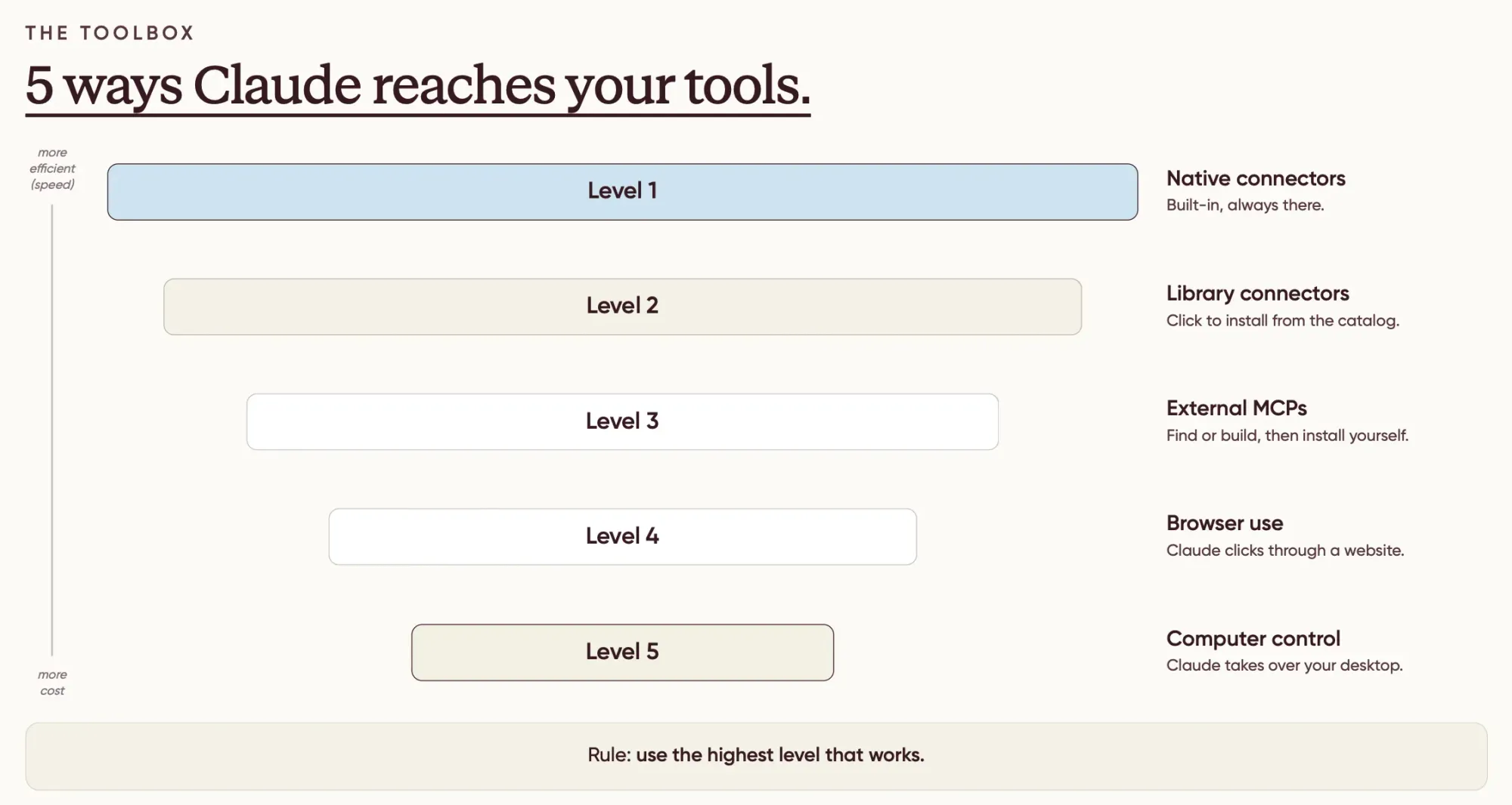
Level 1 — Native connectors. Built into Claude by default, no setup required. The Excel connector is one example — it's pre-installed when you download the Claude desktop app
Level 2 — Library connectors. Available in Anthropic's connector library. One click to install, then one click to authenticate with your account. This is where most major B2B tools live: HubSpot, Slack, Gmail, Google Drive, Notion and more. Start here.
Level 3 — Custom MCPs. Tools not yet in Anthropic's library. You find the MCP yourself — usually on the tool's own documentation page — and install it manually. Two types exist:
- Server-based MCPs: the tool provides a URL endpoint. You paste it into Claude's custom connector field. No installation on your computer.
- Computer-based MCPs: require a small program running on your machine. Slightly more involved. If the setup instructions look complex, ask Claude to walk you through them step by step — that's usually the fastest route.
Level 4 — Browser use. No MCP exists for the tool, but Claude can still access it by opening your browser and navigating on your behalf. The process is slower and uses more credits because Claude takes screenshots, reads them and works from what it can see. But it works for tools locked behind a login.
Level 5 — Computer use. The same approach as browser use, applied across your entire desktop. A last resort when nothing else is available.
For anything you'll run more than once, always try to find a Level 2 or 3 option first. Levels 4 and 5 cost significantly more credits and take considerably longer.
How to Install a Connector: The Practical Steps
Open the Claude desktop app. Go to Customize in the sidebar, then select Connectors. Two paths from there:
Browse connectors opens Anthropic's vetted library. Find your tool, click the plus icon, authenticate with your account. Takes about two minutes.
Custom connectors is for anything not in the library. Find the tool's MCP documentation, copy the URL or endpoint, paste it into the custom connector field. If it's a server-based MCP (the simpler kind), that's all you need to do, no installation required on your computer.
Once installed, the connector persists. You don't re-authenticate each session.
Use Case 1: A Weekly LinkedIn Performance Dashboard
LinkedIn doesn't have an MCP. The company restricts external access to its data, which means no connector exists and no workaround is available through the official library.
What you can do instead is browser use, Level 4. Because Claude opens your browser and navigates as you, it can access LinkedIn exactly as you would: signed in, with full access to post analytics.
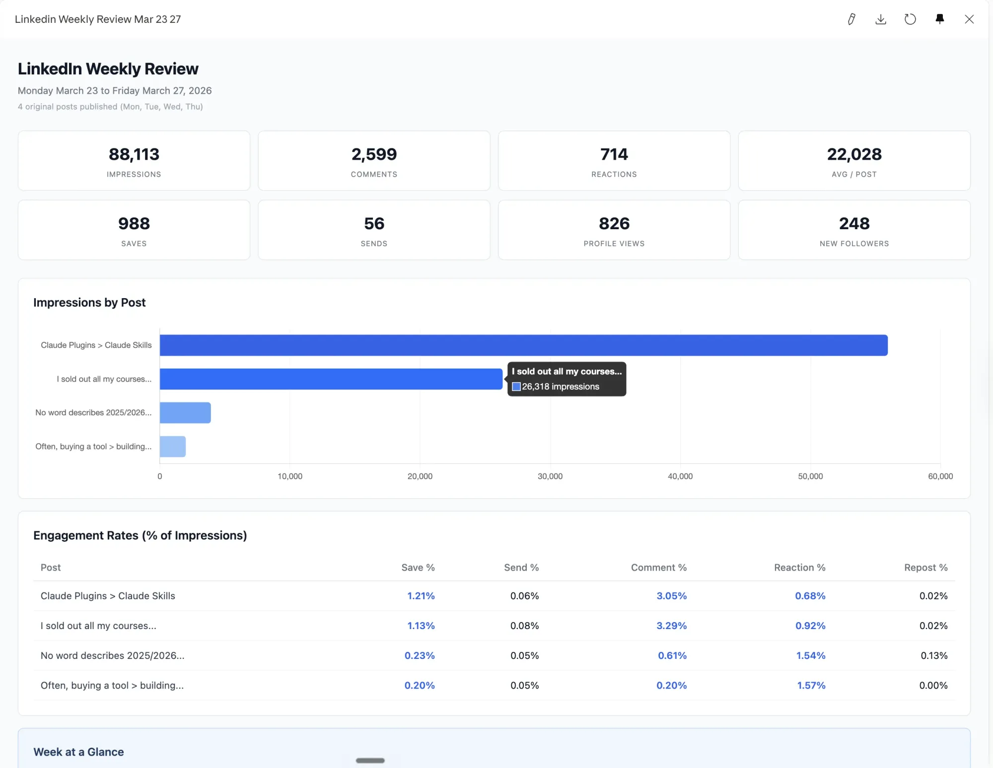
The practical version: set up a scheduled task that runs once a week. Claude opens Chrome, navigates to your LinkedIn activity feed, clicks into the analytics view for each recent post and extracts impressions, reactions, saves and engagement rate. It then compares week-on-week, identifies top-performing posts and surfaces the patterns — which formats drive the highest save rate, which topics overperform, where engagement drops.
The output is a dashboard that updates automatically every week without you manually pulling anything.
The prompt structure is simple: specify which page to open, what data to collect on each post, which calculations to run (save rate as a percentage of impressions, for example) and how to display the results. Save that as a scheduled Claude task set to run every Monday morning, and the dashboard maintains itself.
This will cost more credits and take longer than a Level 2 connector workflow. It's the current reality with LinkedIn. But once it's running, the time investment is effectively zero.
LinkedIn dashboard prompt template
1. Open the Chrome browser tools and navigate to: https://www.linkedin.com/in/pietromontaldo/recent-activity/all/

2. Scroll through the activity feed and identify all original posts (skip reposts) published in the current Monday-to-Friday window. Use today's date to calculate the range. Note each post's hook text and relative date.

3. For every post from this week, click the "View analytics" link below it to open the full analytics page. On that page, scroll down and collect ALL of these metrics:
 - Impressions (in the Discovery section)
 - Profile viewers and followers gained (in the Profile activity section)
 - Reactions, Comments, Reposts, Saves, and Sends on LinkedIn (in the Engagement section)
 After collecting one post's analytics, navigate back and repeat for the next post.

4. Once all data is collected, create a React component (.jsx file) saved to the outputs folder using the naming convention YYYY-MM-DD-linkedin-weekly-review.jsx. The component should include:
 - Eight summary stat cards at the top (total impressions, comments, reactions, avg impressions per post, total saves, total sends, profile views, new followers)
 - A horizontal bar chart ranking posts by impressions (use Recharts), top performer in blue (hashtag#2563eb), others in gray
 - An engagement rate table showing save rate, send rate, comment rate, reaction rate, and repost rate as percentages of impressions for each post, with above-average values highlighted in blue
 - An "Engagement x Impressions" insight box analyzing which engagement metrics correlate with higher impressions this week
 - Post detail cards ordered best to worst by impressions, each showing all six metrics, save/send rates, and a 2-4 sentence analysis of why the post performed the way it did
 - Use Tailwind utility classes, clean minimal design, white background, gray borders

5. Refresh the live Cowork artifact. Update the existing artifact id `linkedin-weekly-review-mar-23-27` with `mcp__cowork__update_artifact` (do not create a new one). Regenerate its full self-contained HTML from this week's data, keeping the existing layout: eight summary stat cards, a Chart.js horizontal bar chart ranking posts by impressions (top performer hashtag#2563eb, others gray), the engagement rate table with above-average values highlighted, the insight box, and per-post detail cards ordered best to worst. Keep the `cowork-artifact-meta` name and the `<title>` generic and fixed as "LinkedIn Weekly Review" (no date in the name). Put the current Monday-to-Friday window only in the in-page header subtitle, so the artifact title stays generic across every run while the visible date reflects this week. The artifact opens in the sidebar automatically.

6. After updating the artifact, write a brief summary in the conversation covering:
 - Top performer and why
 - Underperformer insight with one specific improvement suggestion
 - Save/send standout analysis
 - Engagement driver analysis (which metric most tied to impressions this week)
 - One pattern observation
 - One actionable suggestion for next week

Important notes:
- The live deliverable is the Cowork artifact `linkedin-weekly-review-mar-23-27`. Always update it; never create a new artifact id.
- If a post was published less than 2 hours ago, flag it as early data
- The north star metric is impressions; analyze how saves, sends, comments, reactions relate to reach
- Never use double dashes in the output
- Prefix the output file with the current date: YYYY-MM-DD-linkedin-weekly-review.jsx
- Keep the written summary punchy and data-grounded, no generic advice
Use Case 2: A HubSpot Webinar Performance Dashboard (with prompt)
This one is faster and more precise because HubSpot has an official connector in Anthropic's library. Install it, authenticate, and Claude can query your CRM data directly at Level 2.
The use case: pull all webinar data from the past year, calculate registration and attendance rates for each event, break down traffic sources by UTM parameter and generate an interactive HTML dashboard you can drill into by event.
Three things that make a meaningful difference here:
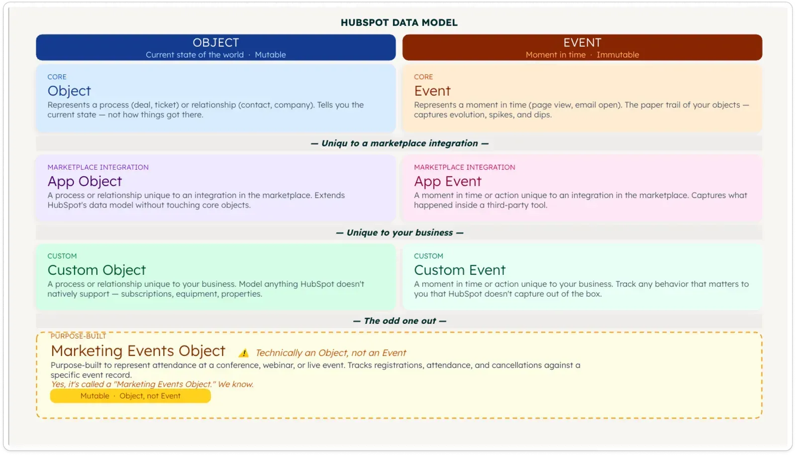
Know the data model. Most webinar platforms store events are Marketing Events. If you include that in your prompt — "look for marketing events in HubSpot" — Claude retrieves the data faster and uses fewer tokens than if you leave it to figure out the structure itself.
Write a structured prompt. A casual ask ("build me a webinar dashboard from HubSpot") will produce something, but a prompt that specifies exactly what to retrieve (registrations, live attendance, no-show rate, UTM sources by event), what to calculate and how to display the results produces a cleaner dashboard and is far easier to debug or reuse. Luuk's prompt for the Contrast webinar dashboard runs to about forty lines, but once written, it works every time. Scroll down to copy the prompt.
The output is a mini web app, not a static table. When you ask Claude to generate a dashboard, it creates an HTML file you open in your browser. It's interactive: you can click into individual events, view full registrant lists, and open contact records directly in HubSpot.
The quality of the underlying data determines how useful the dashboard gets. A webinar platform that sends registration data, watch time, poll answers, CTA clicks and UTM attribution into HubSpot as standard gives Claude significantly more to work with than one that sends only a basic attendance flag. The pipeline attribution article linked below covers how to set up that data layer in HubSpot, the Claude MCP dashboard becomes much more powerful once that foundation is in place.
One step further: combine the HubSpot MCP with a LinkedIn MCP (unofficial options exist) to take a cohort of your most engaged attendees, people who watched over 70% and answered a poll, for example, and send connection requests to that specific group in one action. The engagement data already lives in HubSpot. The MCP puts it to work.
Webinar performance dashboard prompt template
```
# Webinar Performance Dashboard
You have the HubSpot MCP tool connected. Use ONLY the HubSpot MCP tool for all data retrieval. Do not write code, scripts, or direct API calls of any kind.
Build a webinar performance dashboard by following the steps below in order. Render the final result as a single self-contained HTML artifact using Chart.js (via CDN) for charts and vanilla CSS for styling. Do not summarise results as text — the entire output must be the HTML artifact.
---
## Step 1 — Detect webinar platform
Search `marketing_events` (limit 1, sorted by `hs_createdate` descending). Read `hs_object_source_detail_1` from the first result.
- If no marketing events exist → stop and respond: "We couldn't find a connected webinar platform in your HubSpot account. What is the name of your webinar platform?"
- If found → record the platform name. Also extract two things from the `urlTemplate` in the response:
1. The **portal ID** (the number in the URL path, e.g. `25470919`)
2. The **HubSpot domain** (either `app.hubspot.com` or `app-eu1.hubspot.com`)
Store both — you'll use them to build contact links later.
---
## Step 2 — Fetch all webinars from the last 365 days
Calculate today's date minus 365 days as an epoch millisecond timestamp.
Use `search_crm_objects` on `marketing_events` with:
- Filter: `hs_event_type = WEBINAR`
- Filter: `hs_start_datetime > [365-days-ago epoch ms]`
- Properties: `hs_event_name`, `hs_start_datetime`, `hs_registrations`, `hs_attendees`, `hs_noshows`, `hs_event_status_v2`, `hs_event_url`, `hs_object_source_detail_1`
- Sort: `hs_start_datetime` descending
- Paginate (200 per page) until all results are retrieved
Store the full list. For all performance averages and counts, use only events where `hs_event_status_v2 = completed`.
**Scale check:** Count the completed events. If there are more than 20, ask:
> "Found [N] completed webinars in the last 365 days. Pulling registrant contacts for each one will take a while. Should I show all [N] events or just the 10 most recent?"
Wait for the answer before continuing to Step 4. Step 3 always uses the full list regardless.
---
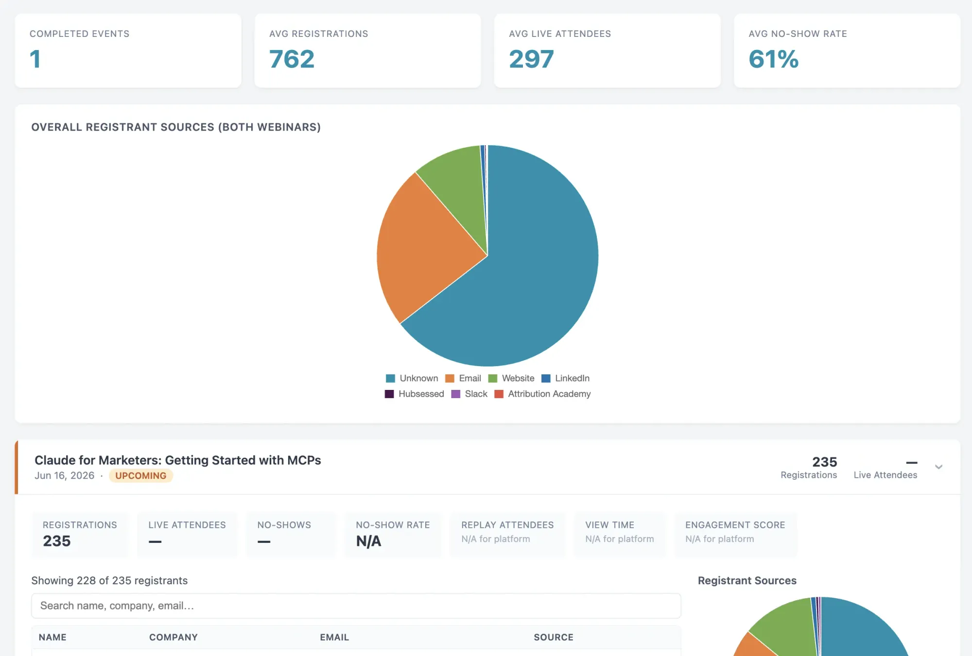
## Step 3 — Overall performance metrics
Compute from all completed events:
| Metric | Calculation |
|---|---|
| Total events hosted | Count of completed events |
| Avg registrations | Mean of `hs_registrations` |
| Avg live attendees | Mean of `hs_attendees` |
| Avg no-show rate | Mean of (`hs_noshows` / `hs_registrations`), skip events where `hs_registrations = 0` |
| Avg view time / completion rate | → "Not available with your webinar platform" |
**Overall UTM source breakdown:**
This chart shows the source distribution of contacts who registered via your webinar platform in the last 365 days.
Use `search_properties` on `contacts` with keywords matching the platform name from Step 1 to find the UTM/source property synced by that platform (e.g. `contrast_original_source`, or a similar field). Then:
- Search `contacts` where that source property `HAS_PROPERTY` and the registration date property is within the last 365 days (if a date property exists). Otherwise omit the date filter.
- Fetch the source property. Paginate until complete.
- Group by value; bucket null/empty as "Unknown".
- If no platform-specific source property is found, fall back to `hs_analytics_source` on contacts where `hs_analytics_source HAS_PROPERTY`.
Render as a donut chart in the final HTML artifact.
---
## Step 4 — Per-webinar detail
For each completed webinar in scope (most recent first), collect the following.
**Counts (already fetched in Step 2 — no additional API calls needed):**
- Registrations: `hs_registrations`
- Live attendees: `hs_attendees`
- No-shows: `hs_noshows`
- Replay attendees: → "Not available with your webinar platform"
- View time / completion rate: → "Not available with your webinar platform"
- Engagement score: → "Not available with your webinar platform"
**Registrant contact list:**
1. Use `search_properties` on `contacts` with keywords matching the platform name from Step 1 (e.g. `["contrast", "registration", "last_event"]` for Contrast, `["zoom", "webinar", "registration"]` for Zoom, etc.). Look for any property that stores a recent event name, slug, ID, or join link — something that can be matched back to the current marketing event.
2. From those results, identify the best candidate property — typically named like `[platform]_last_registration`, `[platform]_last_event`, `[platform]_webinar_joinlink`, or similar.
3. Determine the match value from the current marketing event: try `hs_event_name` first (exact name match), then fall back to the slug extracted from `hs_event_url` (last path segment after the final `/`).
4. Search `contacts` where `[candidate property] = [match value]`. Fetch: `firstname`, `lastname`, `email`, `company`, and the UTM source property found in Step 3.
5. If the search returns results → paginate until complete, then render as a table: Name | Company | Email | Source | [Open in HubSpot]
- Build each contact link: `https://<hubspot-domain>/contacts/<portal-id>/contact/<contact-id>`
- Show above the table: *"Showing [X] of [hs_registrations] registrants"*
- Show below the table as a small muted note: *"The full registrant list is stored in HubSpot's Marketing Events API, which is not yet accessible via the HubSpot MCP. Some contacts may be missing if they later registered for another event. For the complete list, open this event in HubSpot."* — link to `hs_event_url`
6. If `search_properties` finds no relevant property, or the contact search returns 0 results → show grey pill: *"Not available with your webinar platform"*
**Per-event UTM source donut chart:**
Use the contacts retrieved above. Group by their UTM source property; bucket null/empty as "Unknown". Render as a small donut chart inside the event card. If no contacts were retrieved → show grey pill: *"Not available with your webinar platform"*
---
## Step 5 — Render as a single HTML artifact
Build one self-contained HTML file. Inline all data as JavaScript variables — no API calls from the browser.
**Structure:**
1. **Sidebar navigation** (fixed, left, 220px wide):
- App name: "Webinar Dashboard" in small semibold text
- Platform badge below it: platform name in a small monospace pill
- Nav items (non-functional, visual only): Overview · Events · Registrants
- "Overview" highlighted as active
- Date range shown at the bottom of the sidebar in muted small text
2. **Main content area** (left-offset by sidebar):
**Overview section:**
- Section label: "OVERVIEW" in 11px uppercase tracked letters, muted colour
- 4 stat cards in a row — each card has:
- Metric label in small muted text (12px)
- Value in large semibold text (28px) with `font-variant-numeric: tabular-nums`
- Thin `1px` bottom-border, no shadow
- Fields unavailable for this webinar platform shown as a grey pill: "Not available with your webinar platform"
- UTM source donut chart below (`cutout: '65%'`), max-width 360px, left-aligned, with a clean inline legend showing source → count → percentage
**Events section:**
- Section label: "EVENTS" in same uppercase muted style
- Each event is a row separated by a `1px border-bottom`
- Row shows: event name (semibold) · date (muted, monospace) · registration count · attendee count · status badge
- Status badge: "Completed" as a green pill (`background: #f0fdf4; color: #16a34a; border: 1px solid #bbf7d0`)
- Clicking a row expands an inline detail panel below it containing:
- 5-column metric strip (same stat card style, 16px value size)
- Unavailable platform metrics shown as grey pill: "Not available with your webinar platform"
- Small donut chart + inline legend for per-event UTM (or grey pill if not available)
- Registrant table (see below)
**Registrant table:**
- No outer border — `border-bottom: 1px solid #f1f2f4` between rows only
- Column headers in 11px uppercase muted text
- Row hover: `background: #fafafa`
- "Open in HubSpot" as a small `↗` icon link, muted, underline on hover
- "Showing X of Y registrants" subtitle above the table
- Muted 12px note below: *"The full registrant list is stored in HubSpot's Marketing Events API, which is not yet accessible via the HubSpot MCP."* with a "View in HubSpot ↗" link
**Design tokens:**
- `--bg` #ffffff
- `--bg-subtle` #fafafa
- `--border` #e8e9ec
- `--border-light` #f1f2f4
- `--text` #0d0d0d
- `--text-muted` #8a8f98
- `--text-xmuted` #b0b4bc
- `--accent` #5c6bc0
- `--accent-light` #eef0fb
- `--green` #16a34a
- `--green-light` #f0fdf4
- `--green-border` #bbf7d0
- `--radius` 6px
- `--radius-sm` 4px
- `--font` 'Inter', system-ui, -apple-system, sans-serif
- `--font-mono` 'JetBrains Mono', 'Fira Mono', monospace
**Fonts:** `https://fonts.googleapis.com/css2?family=Inter:wght@400;500;600&display=swap`
**Chart.js:** `https://cdn.jsdelivr.net/npm/chart.js`
After instantiating all charts, add this snippet just before `</body>` to ensure they render correctly on load:
`<script>window.addEventListener('load',()=>{setTimeout(()=>{Object.values(Chart.instances).forEach(c=>c.resize())},50)})</script>`
**Chart style:**
- No gridlines, no axis labels
- Tooltip: white background, `1px var(--border)` border, `var(--radius-sm)`, 12px Inter
- Colour palette: `#5c6bc0`, `#26a69a`, `#ef5350`, `#ffa726`, `#ab47bc`, `#66bb6a`, `#8d6e63`
**Responsive:** below 768px, hide sidebar and show a slim top bar instead; single column layout.
---
## Error handling
If a property is missing or null for any event or contact, skip that record gracefully and continue — do not stop. Collect all skipped records and show them in a collapsed "Data warnings" section at the very bottom of the page as small muted grey text — no red, no icons.
```
Use Case 3: Video Editing Without a Video Editor
This one is for anyone repurposing webinar recordings, podcast episodes, or product demos.
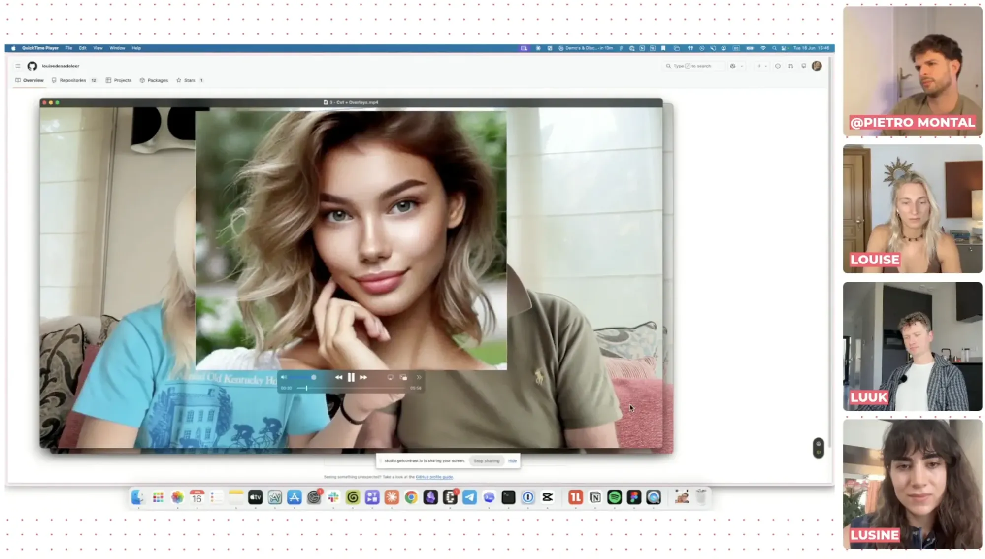
Louise from Tella has built a set of Claude Code skills available on her GitHub through this link that handle the editing steps that normally take the most time:
Cutting silences. Claude reads the transcript and audio waveform together, removes silences and preserves natural pauses and laughter. A 725 MB raw recording came out at 558 MB without losing any substantive content. And of course, no awkward silences.
Adding B-roll. Claude searches for relevant footage on YouTube, news sites, or your local files, and overlays it at the right points in the video. It works best for conceptual content — product walkthroughs, tutorials, anything where a visual of what's being described is more useful than a talking head. For concepts that don't have obvious footage, it can generate motion graphics using [Remotion [LINK: remotion]] — a code-based animation tool.
Vertical conversion. Turns a horizontal recording into 9:16 format with subtitles, ready for short-form distribution.
The skills install directly from Claude Code. Drop a video file path into Claude, specify whether you want an aggressive cut or want to preserve specific moments (punchlines, key points), and the editing runs in the background. Come back in a few minutes.
The honest caveat: this workflow is best suited to linear recordings: one-topic sessions, interviews, tutorials. Complex storytelling where you're reordering content, building narrative arc, or layering sound design still needs a human editor. For standard webinar repurposing, it replaces most of what you'd otherwise hire a freelancer to do.
One Thing to Get Right Before You Connect Anything
The biggest risk with MCPs isn't the setup. It's giving Claude too much permission.
Claude can read, write, edit and delete. For the use cases above, dashboards, analysis, monitoring, read-only access is everything you need, and significantly safer. There are documented cases of agents with write permissions accidentally deleting entire production databases. That's not theoretical.
The default: start with read-only access for every new connector or workflow. If a specific workflow genuinely needs to write or send something, an email follow-up, a LinkedIn connection request, scope the permissions to that one action and nothing else. Don't grant a dashboard-reading workflow the same access as an email-sending automation.
That constraint doesn't limit what you can learn from Claude. It just means that when a prompt goes sideways, the consequences stay recoverable.
FAQ
What is a Claude MCP?
A Claude MCP (Model Context Protocol) is a connection standard that allows Claude to access data from tools outside its own system. Install an MCP for HubSpot, Slack, or another tool, and Claude can query that tool's data directly inside a conversation, no copy-pasting, no manual exports. MCPs that Anthropic has officially reviewed and packaged are called connectors; they install with a single click. Third-party MCPs require a short manual setup.
Do I need Claude Code or the desktop app to use MCPs?
Yes. MCP connections require the Claude desktop app at minimum. Claude Code unlocks additional capabilities, scheduled tasks, custom skills, terminal-based automation. The browser version of Claude doesn't support MCP connections.
Is there a HubSpot connector for Claude?
Yes. HubSpot has an official connector in Anthropic's library. Install it from the Customize section of the Claude desktop app, authenticate with your HubSpot account, and Claude can read your contacts, deals, pipeline and marketing event data (including webinar registrations, attendance, and engagement). Setup takes under two minutes. Learn more about HubSpot MCP.
What's the difference between an MCP and browser use?
An MCP gives Claude direct, API-level access to a tool: fast, credit-efficient and reliable. Browser use means Claude opens your actual browser, navigates the tool the same way you would, and reads screenshots to extract information. Browser use costs more credits, takes longer, and is less precise. It's the right fallback for tools that have no MCP (LinkedIn being the most common example), but not something to use when a connector exists.
Is it safe to connect Claude to HubSpot?
With read-only access, yes. Claude reads your data, it cannot change, delete, or export anything unless you explicitly grant those permissions. For dashboard and reporting workflows, read access is all you need. Be considerably more careful before granting write or delete permissions to any agent or automated workflow.
How much do MCP connections cost?
Connectors and MCPs themselves are free to set up. The cost is in the Claude credits consumed when Claude runs a query. Read-only MCP queries, pulling webinar data from HubSpot, for example, are efficient and use far fewer credits than browser use or computer use. For recurring workflows like weekly dashboards, factor in that Claude Code usage counts against your subscription plan.
Can I build these dashboards without a technical background?
For Level 2 connector dashboards, yes. Installing a vetted connector requires no technical knowledge. Writing a structured prompt is a skill that comes with practice, not a technical barrier. The video editing skills require Claude Code (which runs in a terminal), but Louise's GitHub repo includes step-by-step setup instructions, and Claude itself can walk you through the install if you get stuck.
How do I optimize for token usage?
Be specific in your prompt. Name specific connector, or tool. Set a date range. Ask for a summary and not a raw dump. One task per message or prompt. Are these a few ways to minimize token usage.
This is Part 2 of the Claude for Marketers series. Part 1 covers the essentials: writing content in your own voice, monitoring competitors automatically and scaling ad creative with a Figma integration.
The HubSpot dashboard use case becomes significantly more powerful when your webinar platform is already sending rich engagement data into HubSpot, watch time, poll answers, CTA clicks, UTM attribution, not just who showed up. See how Contrast handles that integration → Book a demo to learn more