
Open most demand generation dashboards and you'll find the same handful of numbers: leads, clicks, downloads, registrants, and a total at the top nobody quite trusts. That distrust isn't paranoia. In Forrester's 2024 survey of B2B marketing leaders, 64% said their own organization doesn't trust its marketing measurement. HubSpot's 2026 State of Marketing report puts proving ROI at the top of marketers' list of challenges.
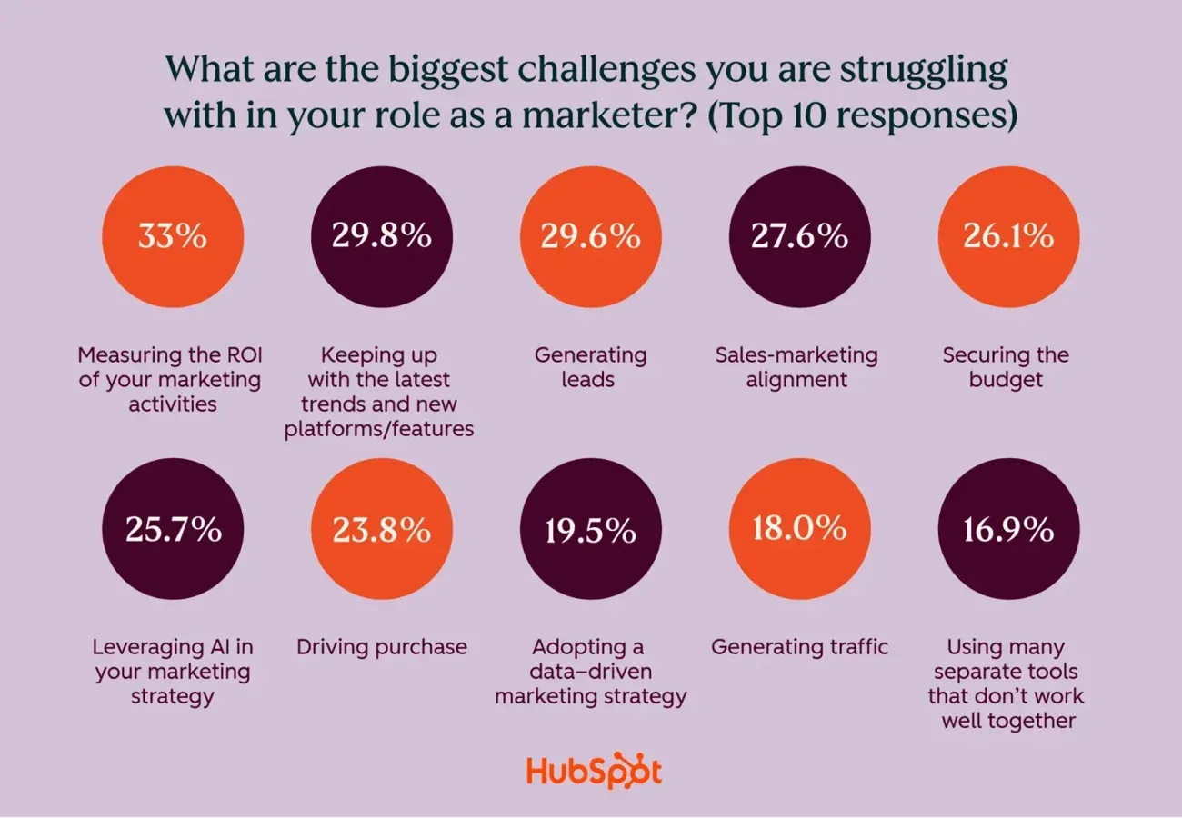
Levent Askan, who runs demand gen at UserGuiding, described a version of this that's easy to recognize: for a long stretch, his team's follow-up process was to hand sales "the registrants list and let's see how it goes" — a habit he now calls the wrong format entirely. The same complaint shows up on every channel a demand gen team touches. Ad platforms report clicks. Content marketing reports downloads. Email reports opens. Every channel inherited a reporting habit built around what's easy to pull, not what predicts revenue.
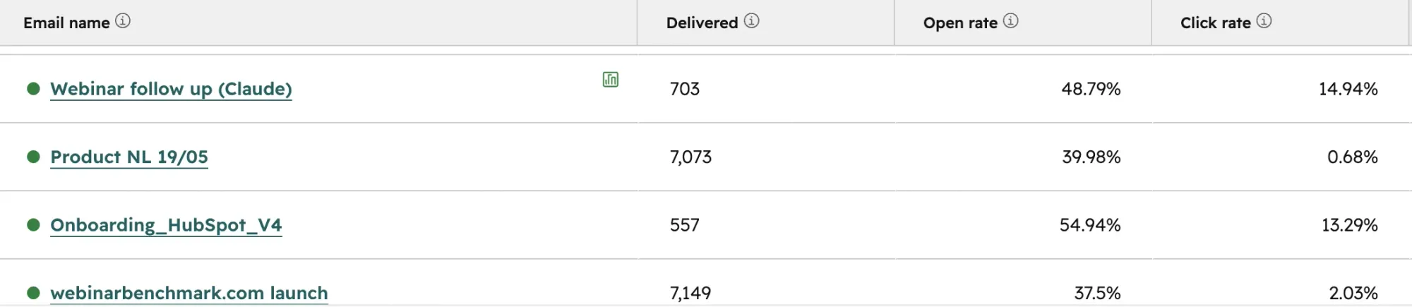
Demand generation metrics fail for a simple reason: most of what gets measured is a proxy for attention, never a signal of intent.
Why Demand Gen Measurement Defaults to Noise
Most teams don't choose their metrics. Their tools choose for them.
Most measurement tools store a single snapshot instead of a history. A CRM contact property holds one value at a time; last email opened, last page visited, last webinar attended, and overwrites it the moment something new happens. There's no way to see a pattern, only whatever happened most recently. Behavioral event tracking works differently: every occurrence gets logged separately, so a team can query the full sequence instead of a single frozen state.
This shows up on every channel a demand gen program touches. Ad platforms report a single last-click conversion and drop the four touches before it. Email tools report an aggregate open rate and lose which specific message someone actually engaged with. Webinar tooling is often the worst offender because the gap is so visible: Zoom's HubSpot integration syncs four static contact fields — last webinar attended, total registrations, total attended, average attendance duration. Nothing about what happened during any individual session. If the tool feeding a CRM only stores snapshots, no dashboard built on top of it will ever show more than headcount, regardless of the channel.
This is also why demand generation metrics content tends to read like a list of financial ratios: CAC, MQL count, marketing-sourced pipeline, with almost nothing about what happened upstream. Those ratios matter. They're also lagging. By the time a CAC number looks bad, the engagement data that would explain why is usually already gone.
The Standard B2B Demand Generation Metrics: Why They're Lagging Indicators
Every demand gen program eventually reports some version of the same five numbers, all downstream of demand generation activity that happened weeks earlier:
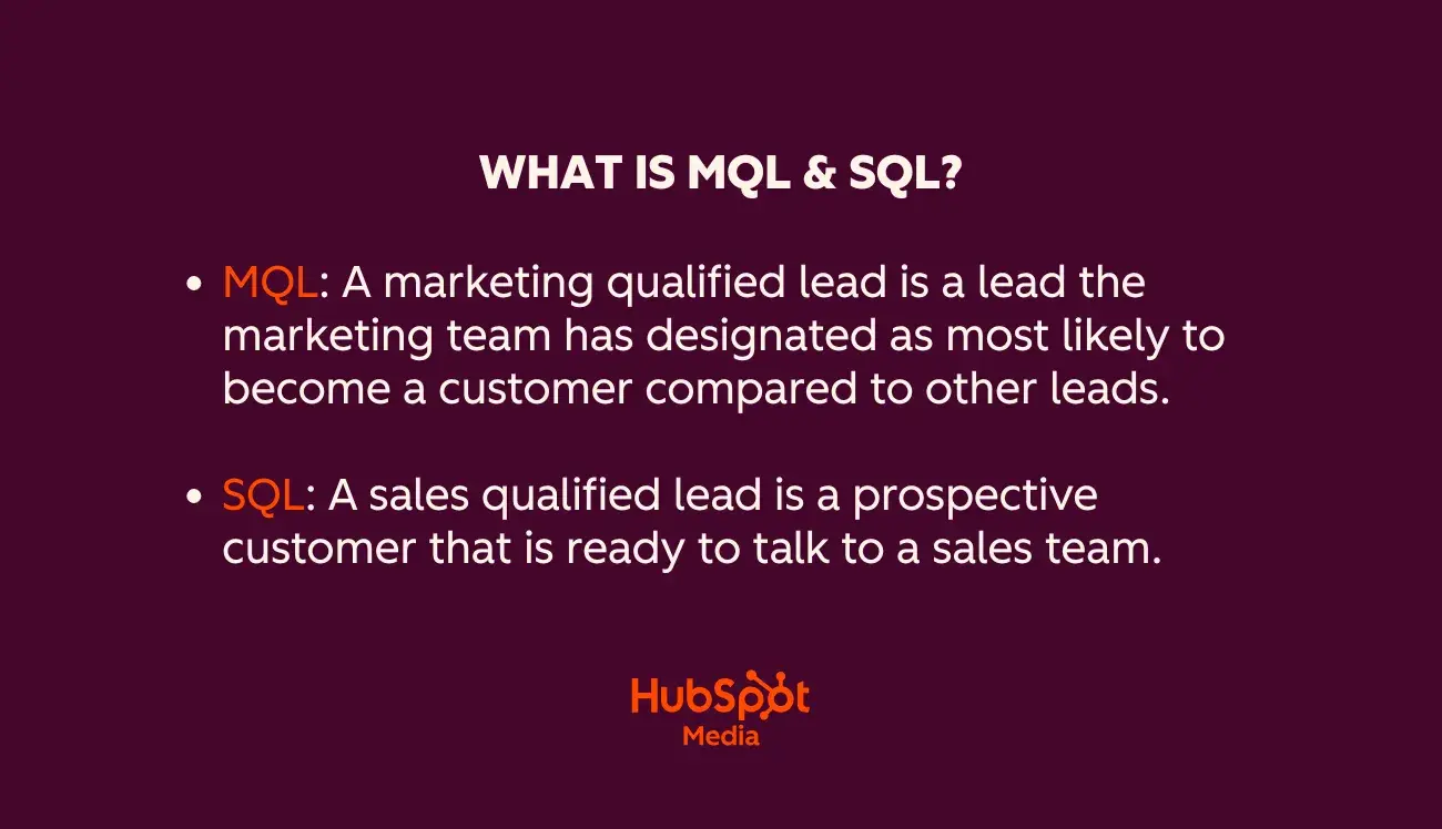
Marketing qualified leads (MQLs)
HubSpot's own definition holds up well: a contact engaged enough with marketing content to be more likely to convert than an average lead, based on behavior, not just demographic fit.
Sales qualified leads (SQLs)
The subset of MQLs sales has accepted as worth pursuing. The MQL-to-SQL conversion rate is a better health check than raw MQL volume, because it exposes a scoring model that's over-counting low-intent contacts.
Customer acquisition cost (CAC)
Total marketing and sales spend divided by new customers acquired. Cheap to calculate, and easy to game: cutting spend lowers CAC without improving targeting at all.
Marketing-sourced pipeline vs. marketing-influenced pipeline
Sourced counts only opportunities where marketing was the first touch; influenced counts any opportunity marketing touched at any point. They answer different questions, and reporting one as if it were the other is a fast way to lose credibility with finance.
Marketing ROI
Revenue attributable to marketing, minus marketing cost, divided by cost.
None of these are wrong to track. They're just lagging. Each one is a rollup of decisions made weeks or months earlier about which contacts got engaged, how, and by whom, reporting only the rollup means finding out something broke long after the point where it could have been fixed.
Top-of-Funnel Demand Generation KPIs: Depth Beats Volume
Volume metrics at the top of the funnel, impressions, form fills, registrants, are the easiest numbers in the entire funnel to inflate and the least predictive of what happens next. Landing page conversion rates make the point cleanly: the median B2B landing page converts around 2.35%, the top 25% clear 5.31%, and the top 10% clear 11.45%, according to WordStream's benchmark data. Hitting the median isn't failing. But volume alone can't tell a team which bucket it's in, only depth-of-engagement data can.
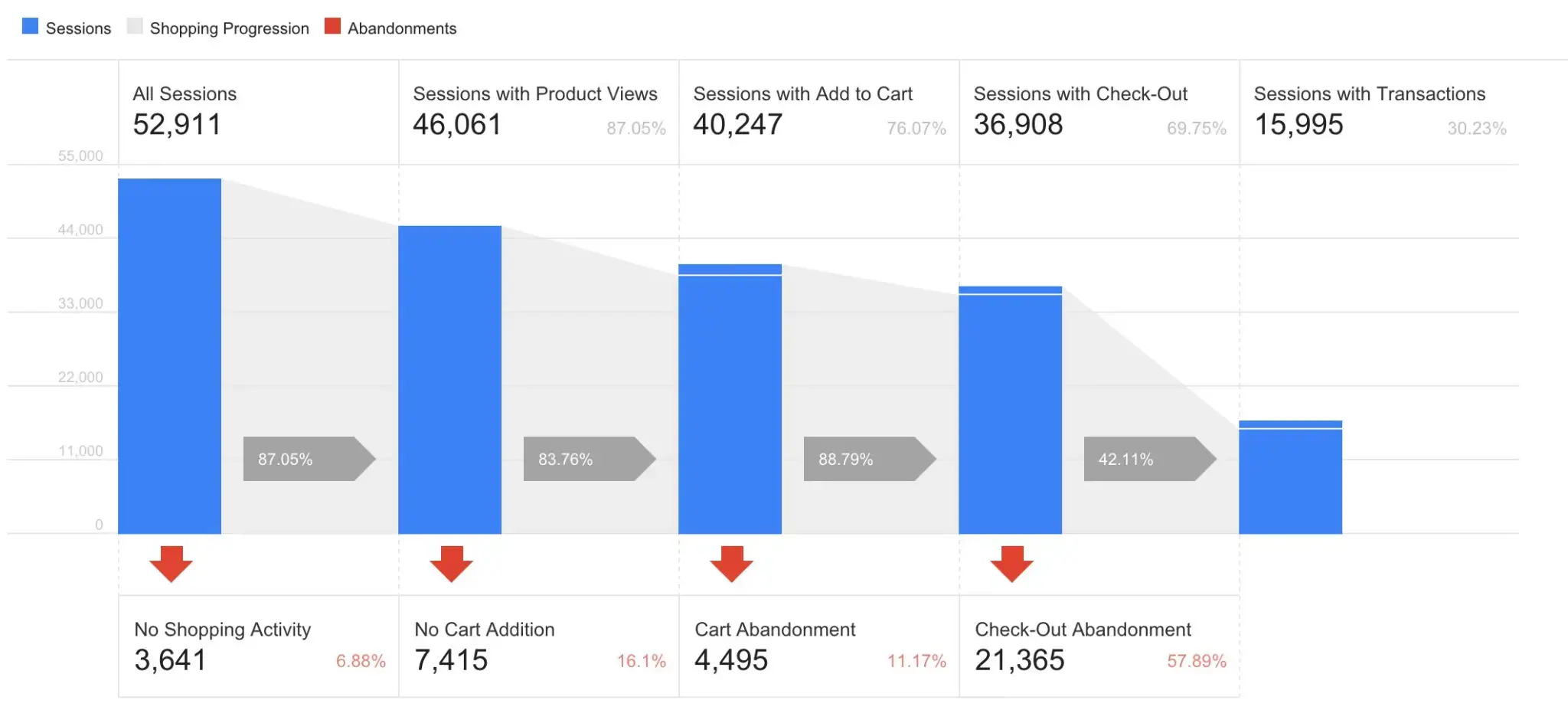
Webinars are a useful case study here because the gap between registration and real engagement is unusually visible. A study from Contrast across more than a million registrants tracked on Contrast's platform, only 61% ever watch a session at all, live or on demand; more than a third of every "registrants" figure is people who signed up and never engaged.
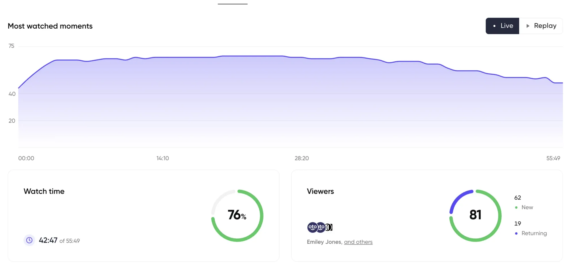
Smaller, tightly targeted sessions also consistently beat larger ones on attendance: audiences under 100 registrants see roughly 6 percentage points higher live attendance than bigger, loosely targeted lists. The same pattern shows up wherever volume gets reported without a quality signal next to it, a gated ebook with a 90% bounce rate on the thank-you page isn't really a download, and an email open isn't a click.
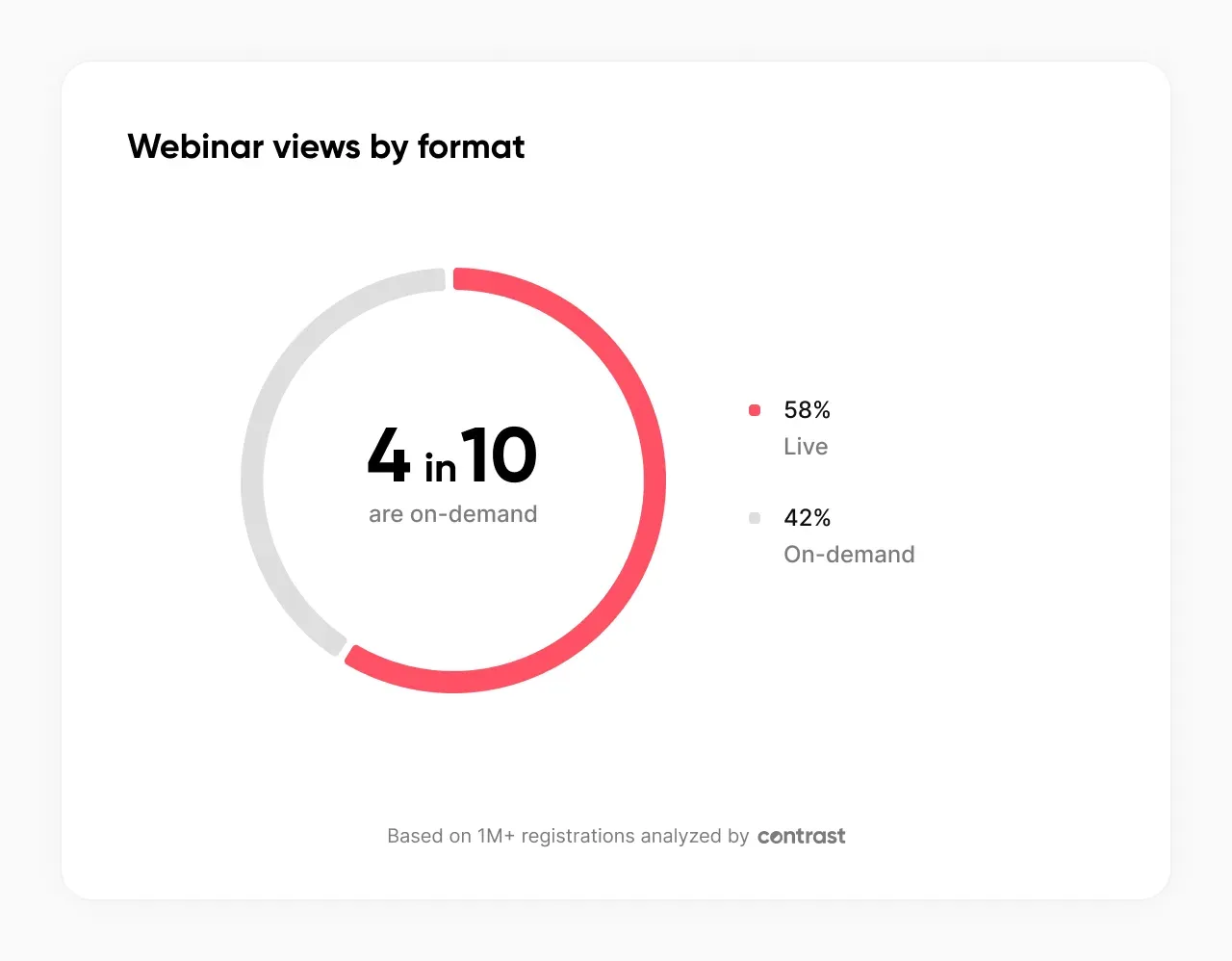
What predicts downstream value, on any channel, is engagement depth rather than headcount: percentage of a page actually read, percentage of a session actually watched, whether someone came back a second time. One data point makes this concrete: 65% of people whose very first touchpoint with a company was a webinar went on to become marketing qualified leads, evidence that depth-of-engagement signals carry real predictive weight once someone bothers to track them.
Turn Engagement Into a Lead Score
Engagement data on any channel is only useful once it's scored, and scoring only works when it combines fit with intent. A contact with a perfect job title who visits a pricing page once and never returns is worth less than a contact with a decent title who's read several guides, revisited the pricing page, and shown up to a live session. Title tells a team who a contact is. Behavior tells them whether that contact is ready.
A workable starting framework combines both: firmographic fit (title, company size, industry) as a baseline, plus points for specific behaviors, a content download, a pricing page revisit, a webinar attended live, a session watched past 75%, a demo requested. A composite score above roughly 30 is a reasonable bar for handing a contact to sales with the underlying behavior attached. Below that, nurture instead of forcing a handoff sales won't work.
Scoring gets meaningfully better when it looks for combinations across channels rather than single actions in isolation, a contact who has downloaded two guides and attended a webinar is a different signal than either action alone, and a scoring model that only checks boxes one at a time misses it. Contrast's engagement timeline pulls this kind of cross-session history into a single view on each HubSpot contact record, so a rep sees the full pattern, not just the most recent touch, before ever picking up the phone.


Turn webinars into measurable revenue
Sync your CRM with Contrast and finally see what’s driving ROI
Book a demoMarketing Attribution and Pipeline Metrics
This is where demand generation metrics fall apart most often, on any channel, because it's the hardest stage to track and the easiest one to fake.
Here's what real life version looks like, worked through on a single Contrast-hosted HubSpot webinar: 858 registrants, 328 live attendees, 199 replay viewers. Tracked through to close, that funnel produced 45 deals created and roughly €4,000 in new monthly recurring revenue, mapped through a customer journey view built entirely from event data, showing conversion rates and time-to-close at every step from registration to deal.
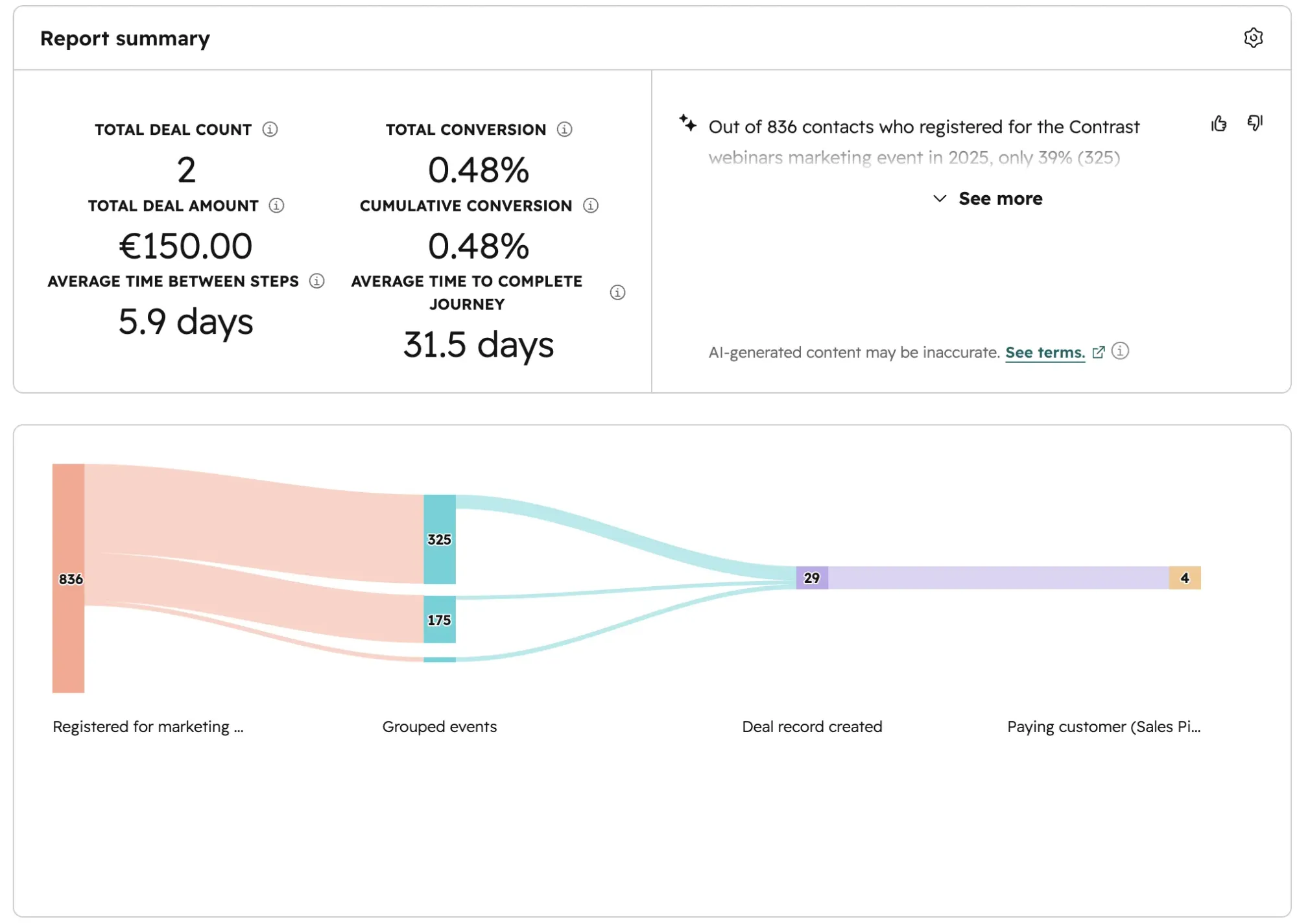
Two things make that number usable instead of just impressive, and both apply regardless of which channel produced the funnel. First, it's built from a sequence of events, not one attribution touch, a full funnel view, not a claim that a single email caused a sale. Second, and more important: call it what it is. This is influenced pipeline, not generated pipeline. Attribution across a funnel like this shows correlation at every stage; it isn't proof the channel alone caused the deal. True incrementality, proving a channel caused revenue rather than just preceded it, needs a holdout test, and that's a separate, harder problem most pipeline attribution dashboards quietly skip past, whether the channel in question is webinars, paid social, or content.
It isn't a one-off result. At Zefort, webinars are now linked to roughly two-thirds of new pipeline creation across the business, a scale that only shows up when engagement data is tracked consistently enough to trace it, not reconstructed after the fact from a spreadsheet.
Ryan Gunn, describing what it would take to get more budget and attention for a channel, put it plainly: "If I had been able to do something like this and show the results and show that it's actually driving pipeline, it's driving revenue, I guarantee you I would have had C-suite on a webinar every single week." That's the actual payoff of tracking this stage properly, on any channel; not a better-looking report, but leadership believes in.
The Metrics Worth Cutting From Your Report
Some numbers earn a permanent spot on a dashboard by being easy to pull, not by being useful. Across channels, cut these or stop reporting them on their own:
- Raw lead or registrant count, on any channel. Report it next to a conversion or attendance rate, or don't report it at all.
- MQL count without an MQL-to-SQL conversion rate next to it. A rising MQL count with a falling conversion rate means the scoring model is broken, not that demand gen is winning.
- Raw click totals — ad clicks, CTA clicks, link clicks. A click means nothing without knowing who clicked and what they did next.
- Blended engagement averages. An average watch time, session duration, or time-on-page hides the split between someone who barely engaged and someone who engaged fully — two very different people counted as the same "average."
None of these are worthless as raw inputs. They're worthless as headline metrics, because a number with no downstream signal attached can't tell a team what to do next. The teams closing the trust gap Forrester found aren't running more dashboards. They're the ones who stopped reporting what was easy to count and started reporting what predicts pipeline.

Turn webinars into measurable revenue
Sync your CRM with Contrast and finally see what’s driving ROI
Book a demoFAQ
What are the most important demand generation metrics to track?
Engagement depth (not raw volume), lead score, MQL-to-SQL conversion rate, and pipeline contribution. Tracked in that order, across every channel a program uses. Raw lead counts and click totals are inputs, not metrics worth reporting on their own.
What's the difference between demand generation metrics and lead generation metrics?
Lead generation metrics measure volume — how many leads came in. Demand generation metrics measure the full funnel, from engagement through pipeline contribution, and should weight quality of engagement over raw count. See demand generation vs. lead generation for the fuller distinction.
What's the difference between marketing-sourced and marketing-influenced pipeline?
Marketing-sourced pipeline only counts opportunities where marketing was the first touch. Marketing-influenced pipeline counts any opportunity marketing touched at any point in the journey. Reporting one as if it were the other is one of the fastest ways to lose credibility with finance.
How do you calculate CAC for a demand generation program?
Total marketing and sales spend over a period, divided by the number of new customers acquired in that period. It's easy to calculate and easy to game — cutting spend lowers CAC without improving targeting — so pair it with pipeline quality metrics before treating a lower CAC as a win.
How do you calculate pipeline attribution honestly?
Track engagement as a sequence of events, not a single touch, then map the funnel from first engagement through deal creation and close using that event history. Present the result as influenced pipeline, not generated pipeline — it shows correlation across the funnel, not proof of causation.
Should marketing or sales own demand generation metrics?
Marketing should own the measurement, but the standard for what counts as qualified needs sales buy-in. A lead marketing calls "qualified" that sales won't work isn't a demand generation win, whatever the dashboard says.